Quantcast
Channel: ambient lighting – Design Indulgences

Hotel Indulgences: Empire Hotel NYC…

$
0
0


The Empire Hotel is a boutique hotel offering big style. When I first laid eyes on this space, I immediately had a visualgasm…

Can I add some square footage to my apt so I can get one of these tufted couches? Fabulous. Earth tones never looked so good. I love it and everything about this room. The floor, pillows, multi height table, the lighting in the back, everything is absolutely stunning…

I really love the bronze tables. The ambient lighting from the wall is such a neat design & it gives this space a cozy relaxed sexy vibe…

Notice that building in the back. It’s where the MTV awards used to be held. This hotel is located on the private corner of West 63rd st between two NYC landmarks–the Lincoln Center & Central Park. Beautifully designed in chocolate and ivory. Really feeling the studded coffee tables which appear to be a crocodile pattern. Continue reading for more indulgences…

Cool border around the headboard and walls…

I need this tiger print chair in my life…

A cool lounge at one of the hotel’s eateries…

From their rooftop area, you could relax in this private cabana adorned with paper lanterns…

{www.empirehotelnyc.com}


Filed under: Hotel Indulgences, Interior Design Tagged: ambient lighting, animal print, earth tones, tufted, visualgasm, zebra

Ambient Lighting:Interiors, Weddings, Pools & Exteriors…

$
0
0
utopia projects contemporary living room

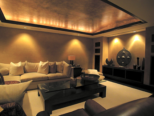
Ambient Lighting really sets the mood for your space as well as highlights wall features, plants and art. Uplights, recessed lights, spot lights, dimmers, even candles can all do the trick. It can really transform the most basic areas…

Corbett Lighting contemporary dining room
Notice the many light sources: For the wall art, the uplight shining on the plant, the chandelier over table and recessed lighting on ceiling…
Habachy Designs  bedroom
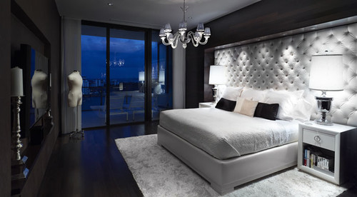
Love the way the light makes the tufted headboard look…
utopia projects contemporary dining room
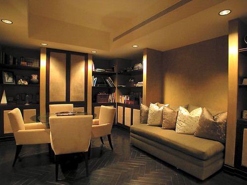
Beautiful herringbone floors & comfy seating nook…
XStyles Bath Design Studio contemporary bathroom
Modern modern bedroom
Very modern wall treatment that brings so much depth to the space. Even the elevated platform bed is lit. Here are a few other posts (1, 2) that has some great ambient lit interiors. Otherwise continue reading for lots more pics…

{Desire to Inspire}

{visionDJs.com}

{Events by Evonne}

I always say if you have a strict budget for a wedding reception or a less than stellar venue, splurge on lighting. It will completely take the focus off ugly carpeting, wallpaper etc. I’ve been to a wedding in a not so fab hotel where the wallpaper was very dated but you didn’t even notice because the lighting was on point.

{blog.outdoorlights.com}

Even lights shown on trees can make a forest less scary, :-). Not only a safety precaution, well lit outdoor areas allows you to appreciate the landscaping at night as well as the day.

night lighting contemporary exterior

{efficient.ws}

Beautiful Moroccan Villa…

{Hilton Pattaya}

Love the glow tables…

{plantnj.com}

This is exactly where I want to be right now in 85 degree temps with a fruity alcoholic beverage. The LIFE!!!


Filed under: Architectural Details, Bathroom, Bedroom, Dining Room, Exterior, Interior Design, Lighting, Outdoor Living, Weddings Tagged: ambient lighting, exterior landscaping, Interior Design, recessed lighting, wedding ideas

Tile & Interior Photography by Brandon Barre…

$
0
0

I’ve come across Brandon Barre’s photography work before and since today I’m finishing the backsplash to the kitchen reno I’m doing, I figured what better way than  to highlight some interiors with nice tile backsplash. I adore this space above because it has some African accents like my own living room. I too have the mask on walls. I love this particular look as I’ve blogged on it HERE before. But it isn’t the LUCITE tables, COWHIDE rug, FABULOUS FLOOR or AMBIENT LIGHTING that I love so much…it’s the tiled FIREPLACE. über sexy…

{Candice Olson}

I remember seeing this episode on HGTV & loved the finished product. The glass tile doesn’t compete with the kitchen. Instead, it’s a compliment to it…

What a tranquil spa feel. I love INFINITE tubs. You can completely submerge yourself…

This tile is actually very similar to what I’ve installed. As a matter of fact, here’s a sneak peek below…

This is before I put the grout in. One thing I’ve learned is that when you pick tile that’s made to interlock, have a glass cutter. It’s a small tool but it helps when 12″ square ft tile can’t fit evenly because of the wall length. Was my brother a happy camper having to cut it for me? Naw. OOPSIE *chelsea lately voice*. I have to put some under cabinet lighting, have the ceiling fixtures installed and my brother has to lay the slate tile down on the floor before it’s complete. Give me a few weeks & you’ll see the finished look to my first kitchen remodel.


Filed under: Uncategorized Tagged: african mask, ambient lighting, backsplash, cowhide, fabulous floor, fireplace, infinite tub, lucite, photography, tile

Paris’ Boutique Hotel Indulgences…

$
0
0

{Hotel Secret de Paris}

Ever since I’ve come across some pictures recently, I’ve been having the urge to see interiors in Paris. It doesn’t hurt that there’s so much purple through out the spaces (my 2nd fav color next to black). So indulge in these two boutique hotels…

{La Belle Juliette}

 The lighting does wonders for the exterior and interior of this hotel. 

The ambient lighting on the shelving is absolutely gorgeous. It really helps highlight everything featured…

Alot of architectural detailing in this photo. To see the rest click HERE.


Filed under: Architectural Details, Boutique Indulgences, Interior Design Tagged: ambient lighting, boutique hotels, paris, Purple Hues

Fabulously Designed Courtyard Areas…..

$
0
0

{Desire to Inspire}

Courtyard areas of homes gives the seclusion and privacy one desires while still allowing indulgences of the outdoor elements…

The second view from a different part of the home. Check out those HIGH GLOSS ceilings…

{Deluxearch}

Love the AMBIENT lighting. This space would not look the same without it…


{House Mags}


Filed under: Architectural Details, Interior Design, Outdoor Living Tagged: ambient lighting, contemporary, courtyard, glossy walls, Interior Design, outdoor living, zen

Saturday Sunday Shindigs: Candlelit Ambience

$
0
0

My apologies for saving these pix to my phone & not remembering where I found them. I try my best to source correctly. Anyhoo lighting plays a huge role in creating the perfect ambience for an intimate setting like a wedding. Not only that but it’s a cost efficient way to transform your space without spending a fortune (as you would for flowers). So here is some inspiration for you. Floating candles on a pool can make a backyard wedding feel more elegant…

Sporadically placed candleholders in the sand makes for a romantic beach sunset wedding…

Ahhhhh this seems so perfect right about now…


Filed under: Bday Parties, Decorating Tagged: ambient lighting, candelit, candlelight, candles, lighting, romantic, wedding

Victoria’s Secret is such a sexy store by the design alone

$
0
0

image

I was in the Chicago area yesterday and after stopping at a mall there I went into their “Vickie’s Secret” and I could hardly contain my excitement. This particular VS looked very different from what I’m used to. The glossy black molding were the bones of the store. So very dark, moody and dramatic. Black and white stripes and damask wallpaper, the perfectly positioned gallery wall and flashes of hot pink makes it sultry.

image

It’s funny because my mom heard someone on HGTV call a design sexy and she couldn’t understand how decor and a room can have that feel. Oh…but it can. Think about the colors, the texture, the glam factor and the feeling the space gives you. Going into their fitting room you had all black doors with dimmed wall sconces lighting the way. It definitely created a sexy atmosphere. In order to NOT look as if I haven’t been anywhere, I limited the amounts of pics I took because the store was crowded.

image

There was a wall full of pink tufted cubes with mannequin torsos in each. They even had sequin mannequins. I really need one of those.

image
Though I hate to see products cluttering a bathroom counter, I commend VS for having such pretty packaging. Who wouldn’t want these staring back at them while brushing your teeth? Their products especially the beautiful perfume bottles will look lovely styled this way.
image

I am obsessed with the Vegas lighting through out the store. I want one of those too. Mine would say “Indulge”…

image

In the fragrance section they had a giant screen playing the Victoria’s Secret fashion show. VS successfully lures in shoppers by their awesome interior. I wish I had a dressing room at home filled with their design elements.

image

Sorry this shot is blurry but I found it funny that all the men in the store waited patiently on pink high back tufted chairs as the women shopped. Lol. I wish I knew what company designs the VS stores because the one in the Woodfield Mall is Schaumburg, Illinois is fabulous.

{All images by me}


Filed under: Commercial Design, Decorating, Furniture, Interior Design, Lighting, Pattern Love, Textures, Wall art Tagged: ambient lighting, black and white, black molding, gallery walls, lacquer, lighting, mannequin, pink, sconces, sequins, sexy, stripes, tufted

If I could create an outdoor oasis next year…

$
0
0

I know that I would want furniture that could withstand the elements and the test of time. When purchasing outdoor furniture and pieces for your home that will last years and even decades, you want to invest in pieces where the craftsmanship is on point, and the outdoor furniture is fully weatherproof. Your selections need to be able to withstand sunny skies and rainy days. I went over to Arhaus to check out their selection of furniture and I came up with two ideas. I definitely would want an outdoor dining table to have dinner al fresco! I really like how these rustproof chairs have a classic French inspired style to them. That really makes it feel very indoors-esque. The tulip styled pewter hued table is the perfect compliment to showcase “Etna”, the circular outdoor rug. The banana leaf pillows is a print that embodies summer and although those aren’t from Arhaus, I think they would look nice on the chairs when not occupied.

I would definitely need….yes need an outdoor firepit. My cousin’s have one that uses real wood and although you smell like a smokehouse afterward, the ambience is so fun for a cool summer or fall evening. I like the sleek look of the concrete especially when lava rocks are used. I also like that it has surface space for wine. Because…..you know… you have to have some sorta cocktail when entertaining. I kid, but seriously there is nothing worse than having to hold your drink the whole night because someone’s yard doesn’t have tables. Lighting really helps elevate the way a space feels, whether it’s indoor or outdoor. Who doesn’t want to extend the life of outdoor entertaining at night? You just need to have a lot of lighting sources which is why I picked string lights, the modern tall steel candlestands and the firepit. I also put some cyliner vases for the dining table to give a romantic feel as well.

Arhaus is currently having a 70% off sale so you may want to check them out.
{Pillows: pink greek key Kohls Dept Store, banan leaf Etsy shop Anita’s Casa}


Filed under: Color Schemes, Decor, Decorating, Exterior, Fireplaces, Furniture, Interior Design, Lighting Tagged: ambient lighting, arhaus, banana leaf, exterior, furniture, greek key, outdoor dining, outdoor living, patio